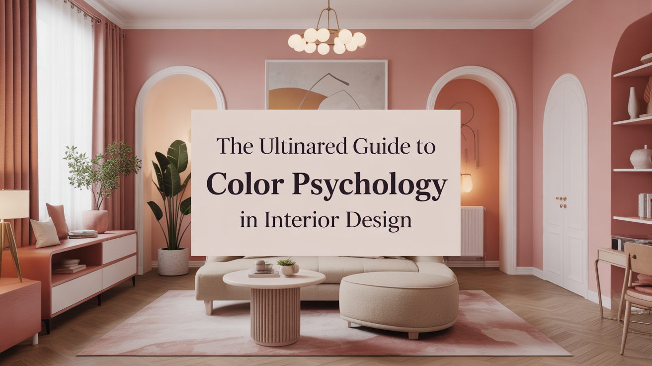
The Ultimate Guide to Color Psychology in Interior Design
1 Understanding Color Psychology in Interior Design
Color is more than a decorative element in a home. It has the power to influence mood, behavior, and even energy levels. Interior designers have long studied how colors interact with light and space to create emotional responses. For example, soft blues can create a sense of calm while warm reds can make a space feel more energized. Understanding these reactions helps homeowners design spaces that not only look beautiful but also feel right for the people who live there. The psychology behind color is rooted in how humans perceive color through their senses and associate it with experiences and memories. Applying this knowledge thoughtfully can transform any room into a sanctuary or a space of productivity.
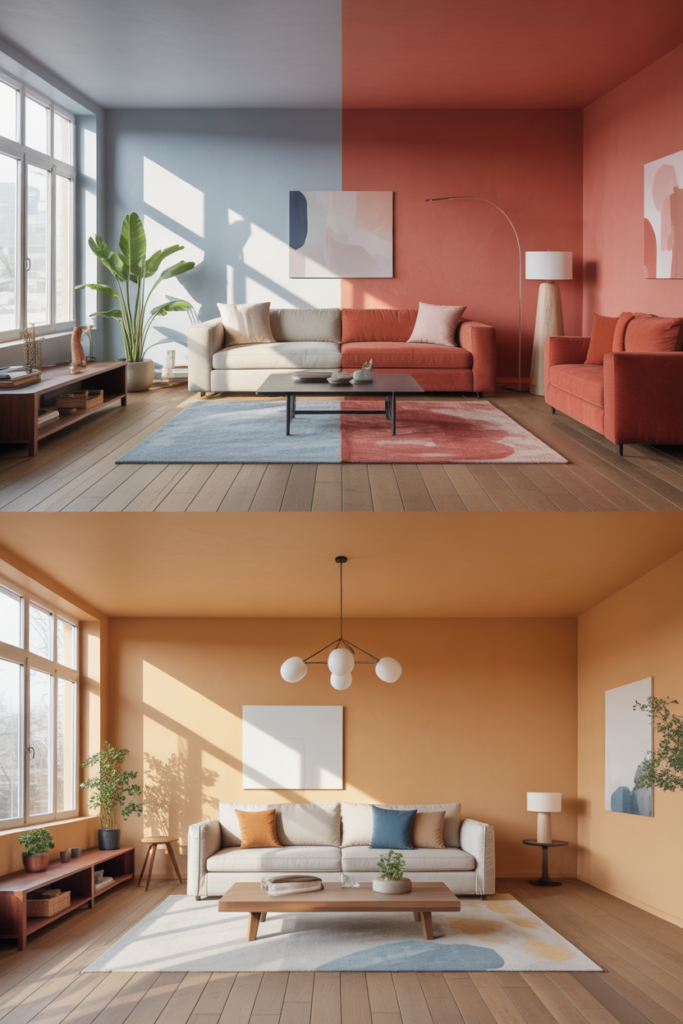
2 How Warm Colors Affect Mood
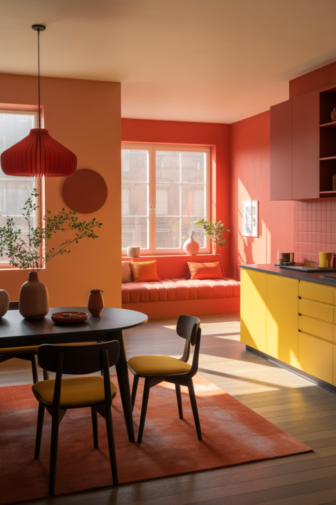
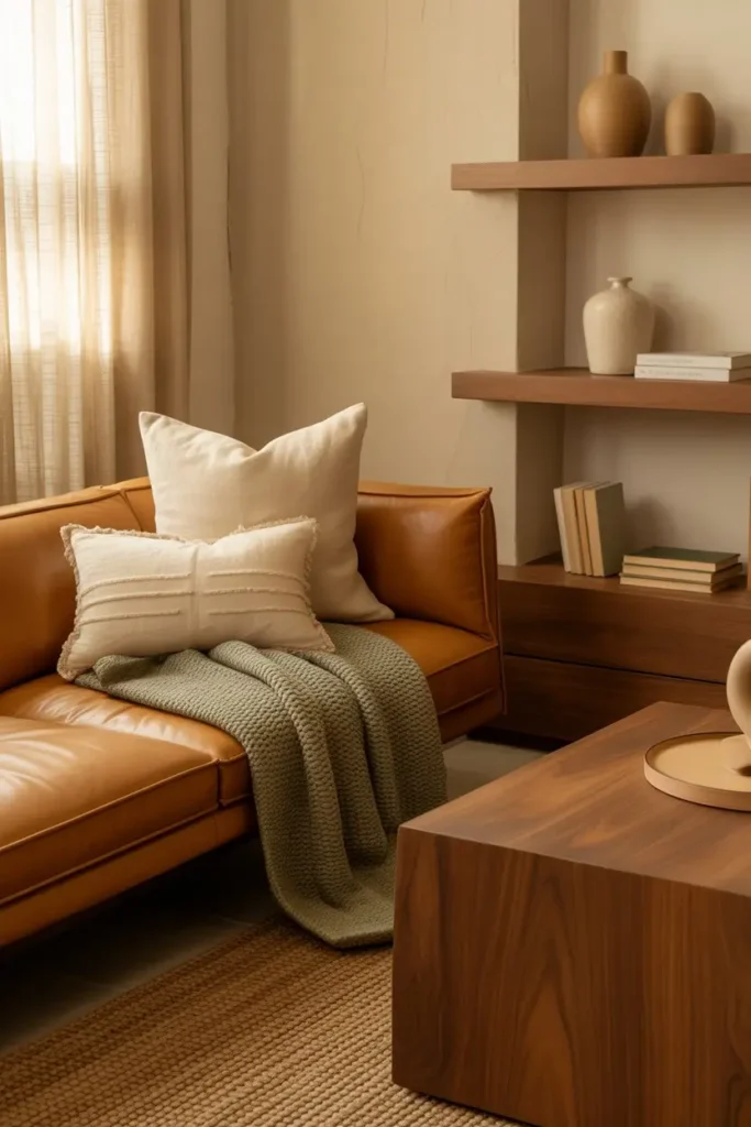
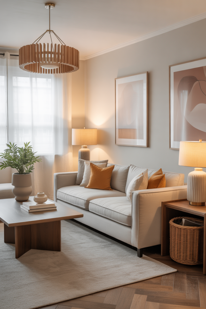
Warm colors such as red, orange, and yellow have a unique effect on emotions. These shades can make a room feel inviting and lively. For instance, a dining room painted in soft orange can encourage conversation and create a feeling of warmth. Red is often used in living areas to bring energy and passion to interactions. Yellow works beautifully in kitchens or breakfast areas because it can evoke happiness and optimism. The key is to balance warm tones so they uplift without overwhelming. Using them strategically on walls, furniture, or accents can create harmony and encourage specific moods without overpowering the senses.
3 How Cool Colors Influence Spaces
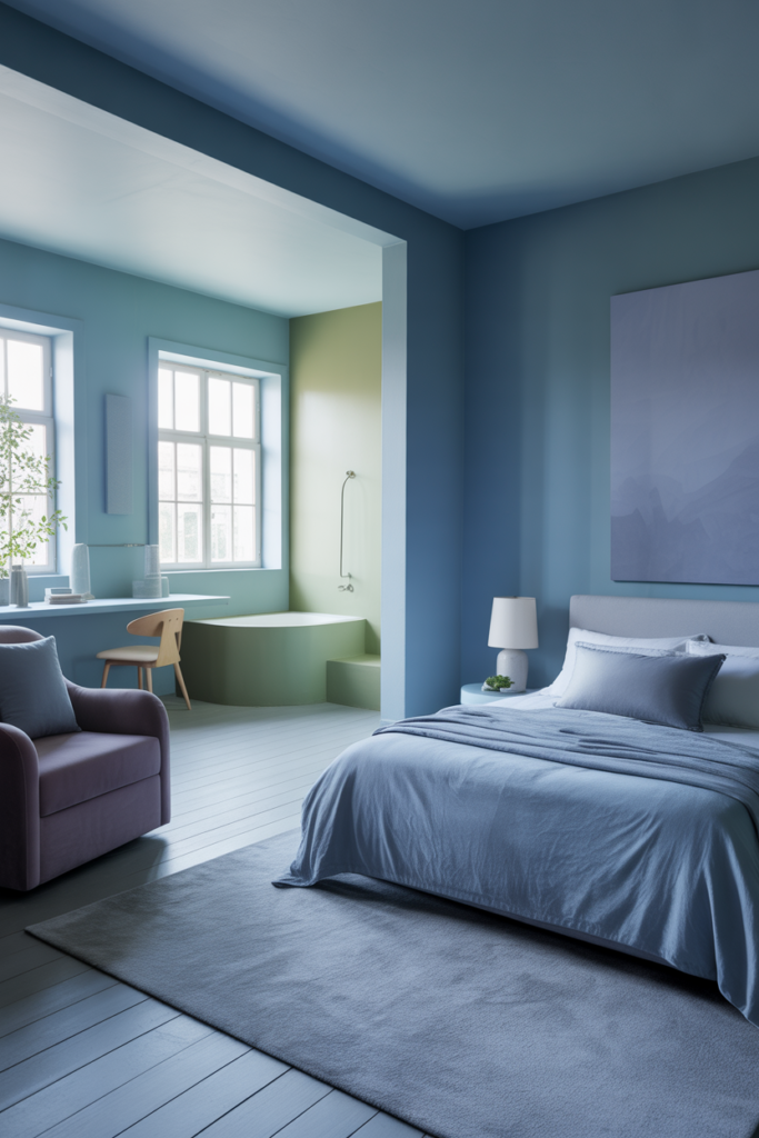
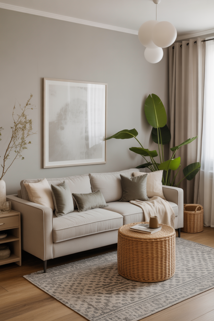
Cool colors like blue, green, and purple bring a sense of calm and tranquility. These shades are ideal for bedrooms, bathrooms, or any area meant for relaxation. Soft blues reduce stress and can even help lower blood pressure while greens connect us to nature and evoke peace and balance. Purple, especially in muted tones, adds a touch of luxury and calm sophistication. Cool colors also give the illusion of more space, making smaller rooms feel larger and more open. Designers often pair cool colors with natural light to amplify these calming effects, creating an environment where the mind can rest and recharge.
4 Neutral Colors and Their Psychological Impact
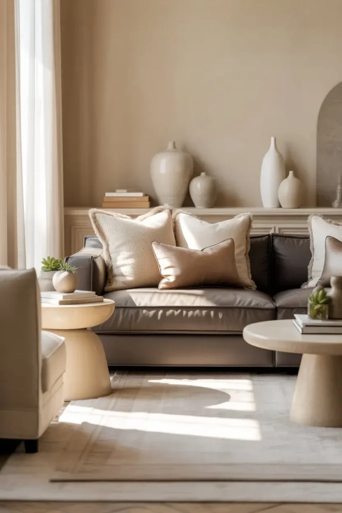
Neutral colors such as white, beige, gray, and taupe serve as a backdrop that can shape the perception of other colors in a room. Whites and creams create a sense of cleanliness and simplicity while grays provide balance and sophistication. Beige adds warmth without being overwhelming. These colors allow flexibility in decorating because they work with a variety of accent colors and textures. Psychological effects of neutrals include promoting relaxation, reducing stress, and creating clarity in busy spaces. Using neutral tones on walls and larger furniture pieces gives a foundation that supports both warm and cool color accents without causing visual fatigue.
5 Combining Colors for Emotional Harmony
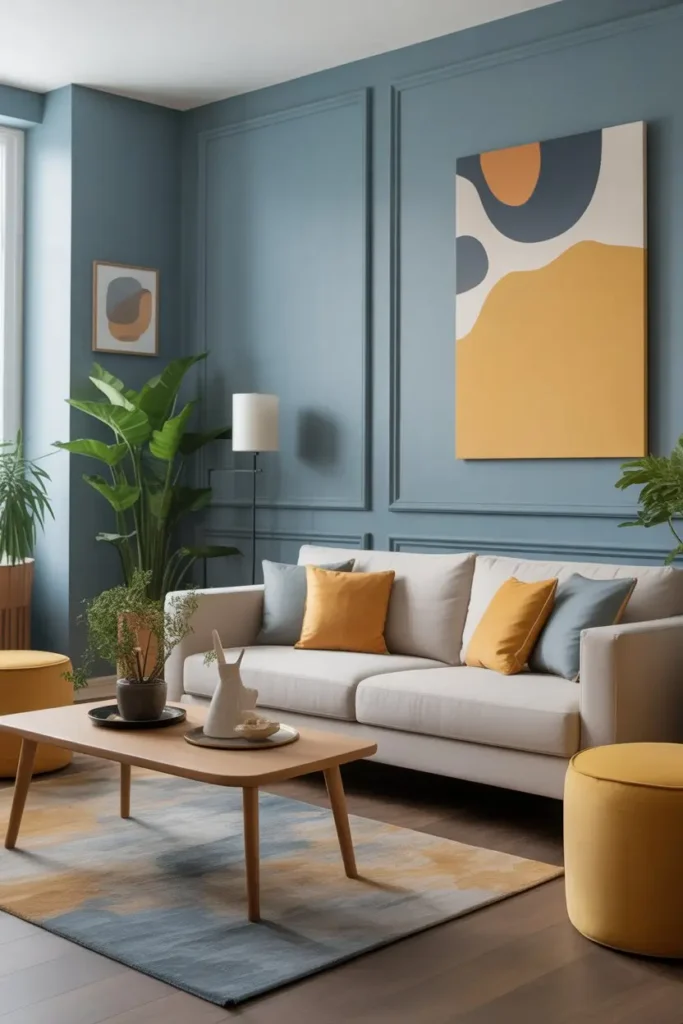
Choosing a single color for a room is simple but may limit the emotional impact. Combining colors can create harmony or dynamic contrast depending on the desired effect. Designers use color theory to pair complementary or analogous colors for balance. For example, pairing soft blue with muted yellow can produce a calm yet cheerful atmosphere. Combining warm and cool tones carefully can create a dynamic yet comfortable living space. The goal is to ensure that colors interact positively, enhancing mood and making the room feel cohesive. By experimenting with shades and intensity, homeowners can find combinations that express personality while maintaining psychological balance.
6 The Role of Color in Different Rooms
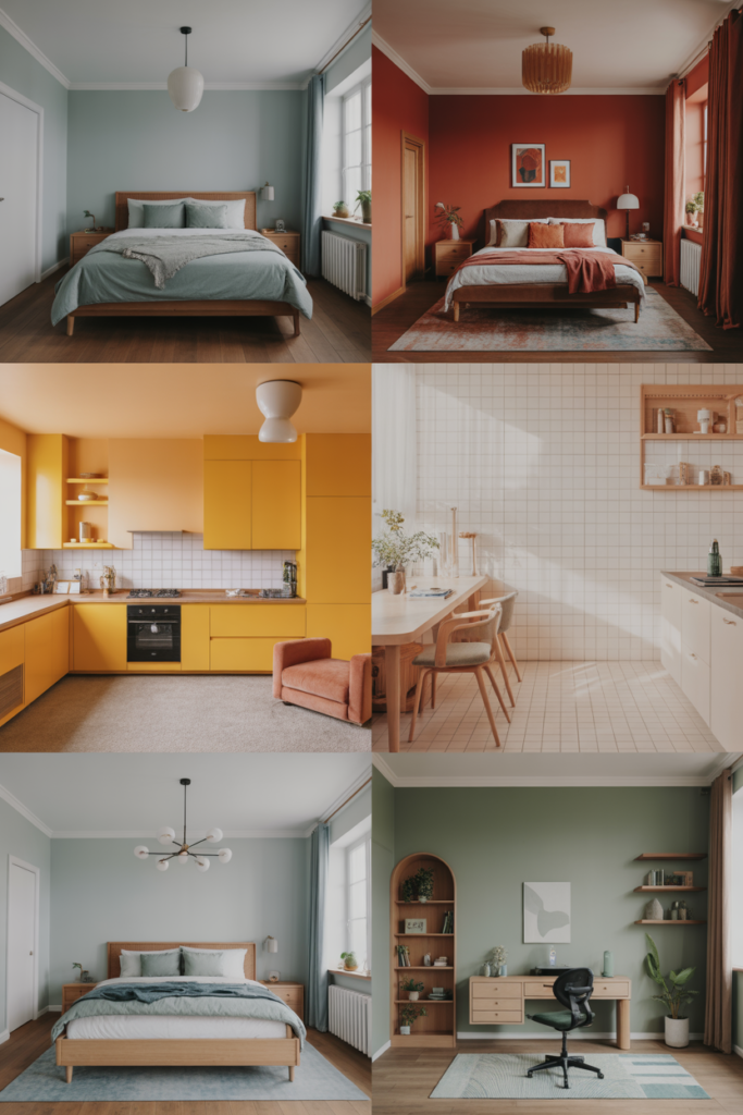
Each room in a home has a distinct purpose and requires a thoughtful color approach. Bedrooms benefit from cool and muted tones to promote rest and relaxation. Living rooms often thrive on warm tones and rich textures to encourage social interaction. Kitchens and dining areas benefit from bright and stimulating colors to inspire energy and appetite. Bathrooms are often best in light and airy shades to evoke cleanliness and freshness. Home offices benefit from colors that enhance focus such as soft blues or muted greens. Understanding the function of each space allows homeowners to select colors that improve mood and performance naturally without relying solely on decor.
7 Cultural Significance of Color in Interiors
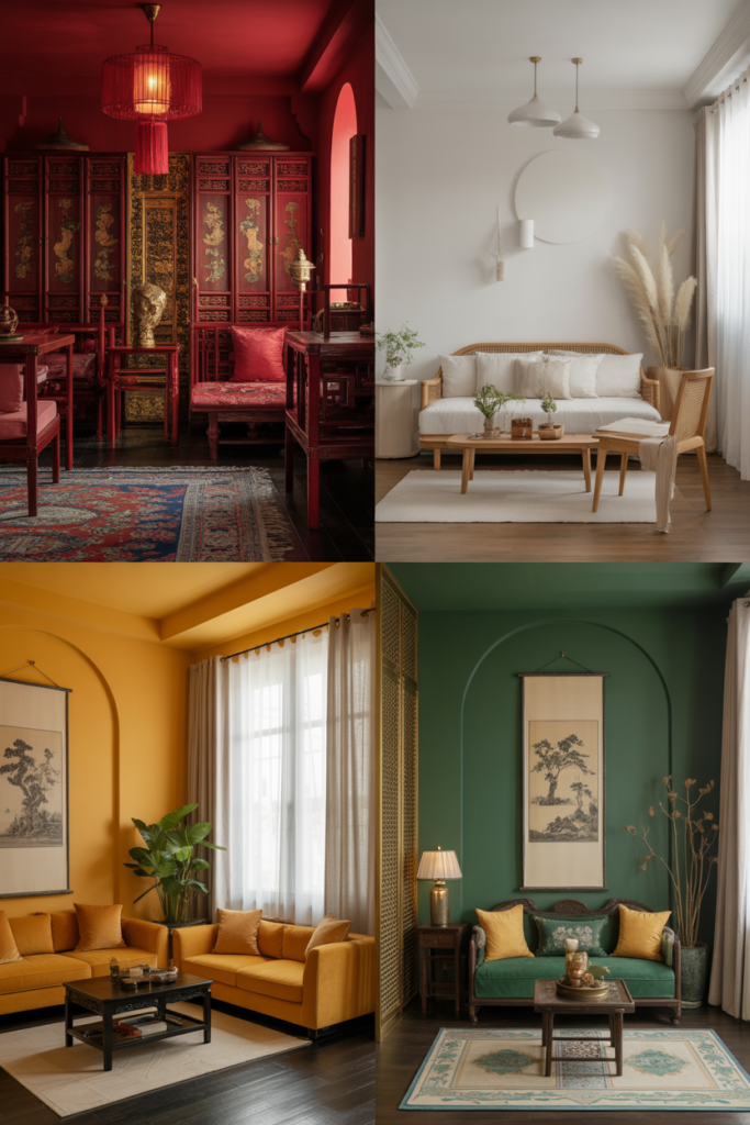
Colors can carry cultural meanings that affect how they are perceived in interior design. Red in some cultures symbolizes luck and prosperity while in others it may signal warning or danger. White may represent purity and cleanliness or in some traditions signify mourning. Considering cultural associations ensures that a space resonates positively with the people who live there or visit. Designers often integrate cultural context into color choices, creating interiors that feel familiar and comforting while also respecting the psychological effects of color. This approach adds depth to design and prevents unintended emotional responses.
8 Using Accent Colors to Influence Behavior
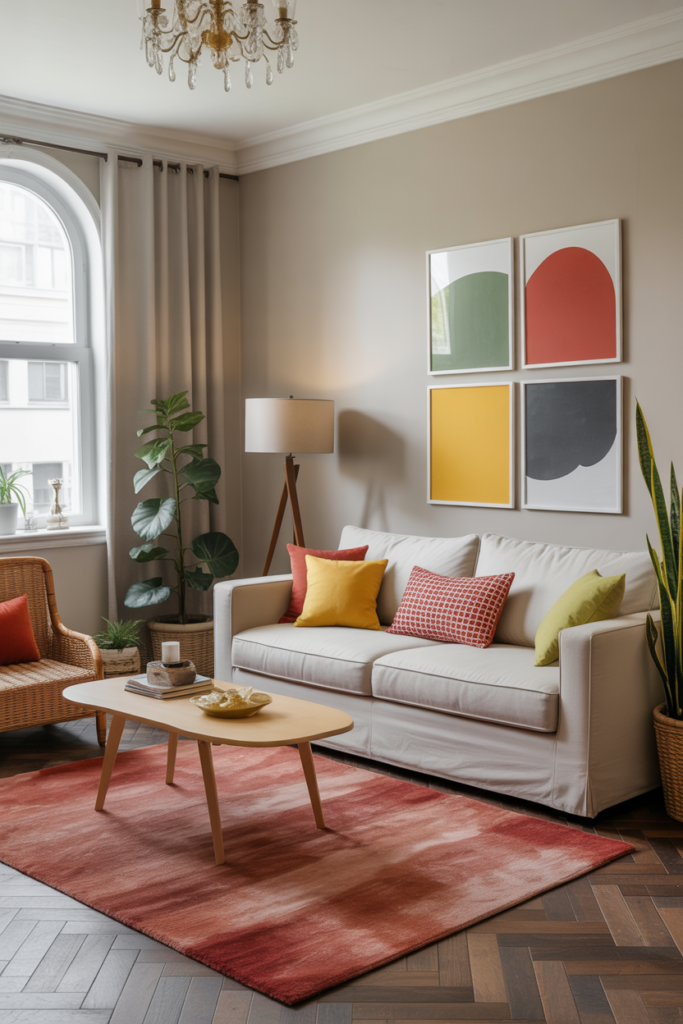
Accent colors are small but powerful elements that can transform a room’s energy. Throw pillows, rugs, or wall art in bold shades can introduce energy or calm without overwhelming the space. Red accents in a workspace can encourage focus and motivation. Green accents in a living room can create a natural, balanced feel. Yellow accessories in kitchens or breakfast nooks can boost happiness and positivity. By carefully placing accents, homeowners can adjust the mood of a room over time, allowing flexibility in design while keeping the base palette stable and cohesive. Accent colors also create visual interest and draw attention to focal points naturally.
9 Color Saturation and Its Psychological Effects
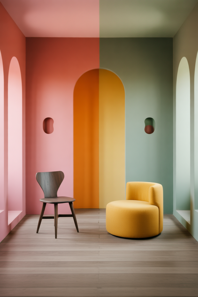
Saturation refers to the intensity of a color and directly affects how it influences mood. Highly saturated colors are bold and energetic while muted colors are calming and subtle. A bright red wall may energize a space but can be overwhelming in a bedroom. Pastel shades offer gentle stimulation and are ideal for areas meant to feel peaceful. Adjusting saturation allows designers to manipulate emotional impact without changing the color entirely. Even a muted shade of green can evoke calm if placed on large surfaces, while a vivid green accent can bring vibrancy and energy. This level of nuance gives control over the psychological influence of each space.
10 Light and Color Interaction
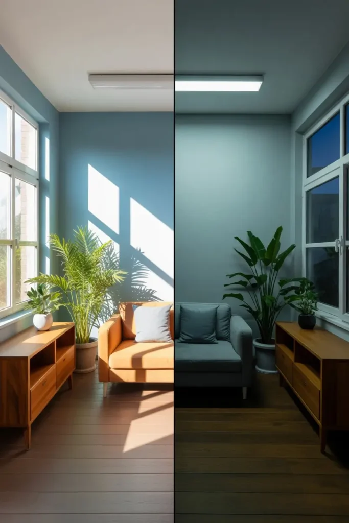
Lighting dramatically changes the perception of color and its psychological impact. Natural light enhances the vibrancy of warm colors and amplifies the calming effects of cool tones. Artificial lighting can alter hue and temperature, making a room feel different at various times of the day. Designers carefully select light sources that complement chosen colors to maintain consistent mood. For example, soft warm bulbs enhance coziness in living areas while bright white light can increase alertness in home offices. Understanding how light interacts with color ensures that spaces evoke intended emotions consistently throughout the day.
11 Texture and Color Connection
Texture interacts with color to create depth and emotional resonance. A soft, plush rug in a muted blue enhances calmness more than a hard surface in the same color. Wood tones paired with warm colors add natural comfort while glossy finishes can intensify the psychological impact of vibrant hues. Designers often layer textures with color to balance stimulation and relaxation. This combination ensures that rooms are not only visually appealing but also emotionally comfortable. By considering texture alongside color, interiors achieve a level of sophistication that appeals to both the eyes and the mind.
12 Color Trends and Timeless Choices
While color trends change every year, timeless choices remain psychologically effective. Soft neutrals, muted blues, and natural greens consistently evoke calm, balance, and warmth. Trendy bold shades may excite for a season but could create fatigue if used extensively. Experienced designers advise mixing timeless base colors with occasional trendy accents to maintain a fresh feel without compromising comfort. This approach allows interiors to evolve with time while keeping their psychological benefits intact. Balancing trend and timelessness ensures long-term satisfaction and prevents costly redecorating driven purely by fashion.
13 Color Psychology in Open Concept Spaces
Open concept homes require careful consideration because colors flow from one area to another. Designers use color transitions to maintain continuity while defining different functional zones. Soft neutral tones often anchor open spaces while warm and cool accents designate living, dining, or work areas. Strategic placement prevents visual confusion and maintains a balanced emotional impact throughout the space. In open concepts, color psychology is crucial because a single overwhelming shade can dominate multiple areas, whereas thoughtful use encourages harmony and supports the intended atmosphere of each zone.
14 Emotional Impact of Dark and Light Colors
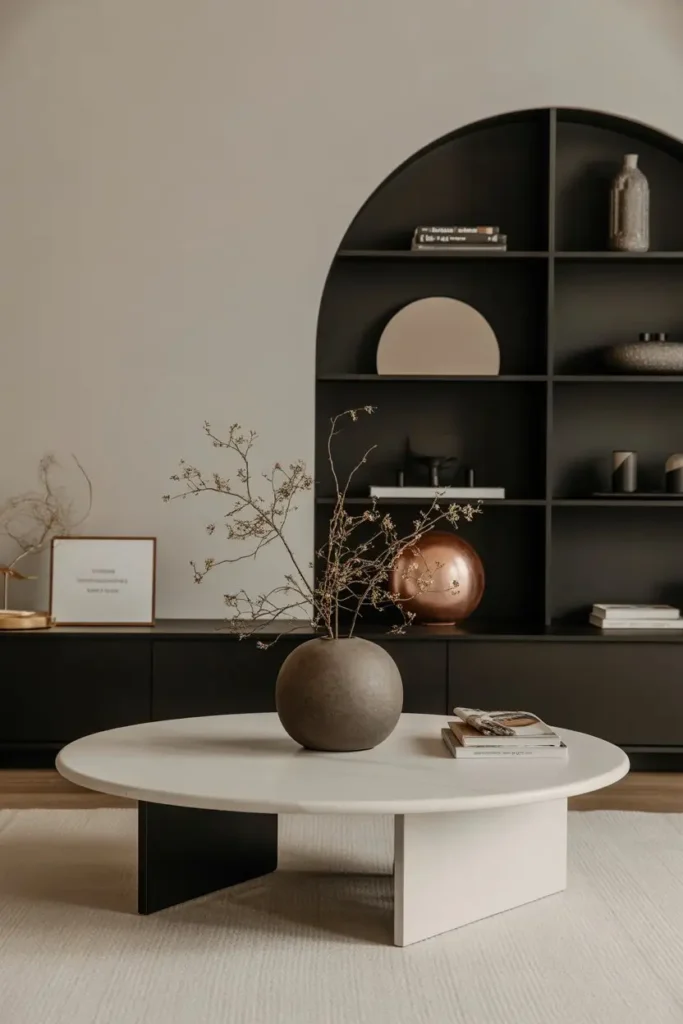
Dark colors create intimacy, luxury, and sophistication but can feel heavy if overused. Deep blues or charcoals add a cozy element to bedrooms and libraries. Light colors open spaces and evoke freshness and simplicity. Soft creams or pastels increase perceived space and encourage relaxation. Designers balance dark and light tones to optimize emotional responses. Pairing dark walls with light furniture or accents maintains psychological balance while allowing dramatic expression. This nuanced approach ensures spaces feel intentional, comfortable, and emotionally aligned with their purpose.
Final Thought
Color psychology is a powerful tool in interior design. It shapes how we feel, interact, and experience our homes. By understanding the emotional impact of warm and cool tones, neutrals, accents, and lighting, homeowners can craft spaces that are both beautiful and nurturing. Thoughtful application of color ensures that each room serves its intended purpose while reflecting personality and style. Every decision in color selection carries the potential to transform a space from ordinary to extraordinary. Embracing color psychology allows your home to become a true reflection of emotional well-being and harmony.
FAQs
What is color psychology in interior design
Color psychology studies how colors affect human emotions and behavior within a space
How do warm colors affect mood
Warm colors like red, orange, and yellow stimulate energy, warmth, and social interaction
Which colors are best for relaxation
Cool tones such as soft blues, greens, and muted purples create calm and tranquility
Can color influence productivity
Yes certain colors like blue and green can improve focus and concentration in workspaces
How should I combine colors in my home
Use complementary or analogous colors for balance and experiment with accents to adjust mood naturally