15+ Interior Paint Colors Ideas That Make Your Home Feel Calm Warm and Timeless
Choosing paint is not about trends alone. Color shapes mood light and comfort. After working with homes for over twenty years I have seen how the right color can make small rooms feel open and cold rooms feel warm. This guide shares interior paint colors ideas that work in real homes not just photos. Every idea is explained in simple words so you can choose with confidence and avoid costly mistakes.
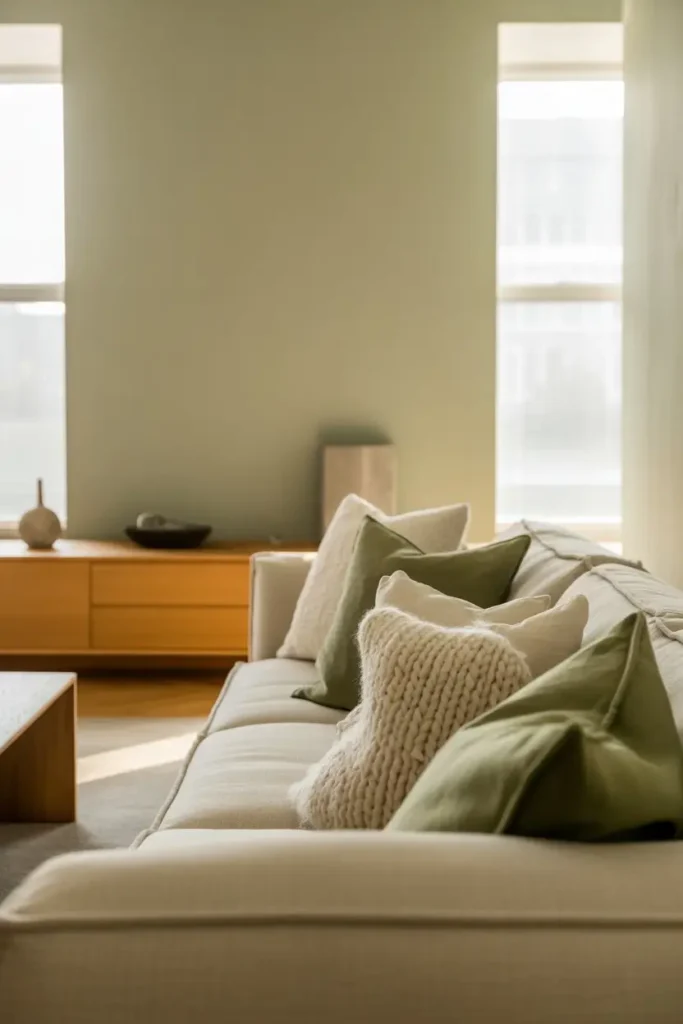
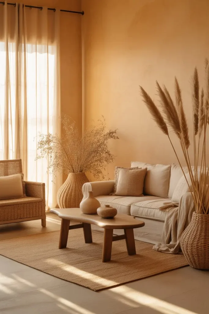
1 Soft Warm White That Feels Lived In
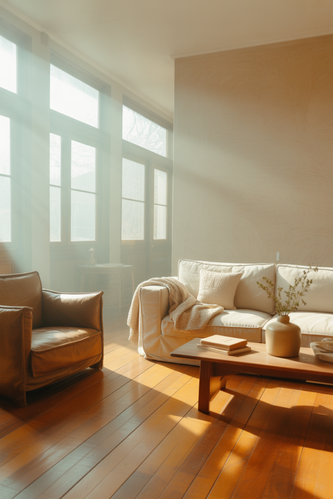
Soft warm white is not bright or sharp. It carries a gentle cream tone that makes rooms feel welcoming from morning to night. This color works well in homes with natural wood floors and warm light. It reflects light without glare and helps furniture stand out. Many people choose white and regret it later because it feels cold. A warm white avoids that problem and gives walls a soft glow that lasts all day.
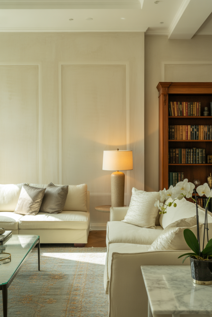
2 Classic Greige for Easy Balance
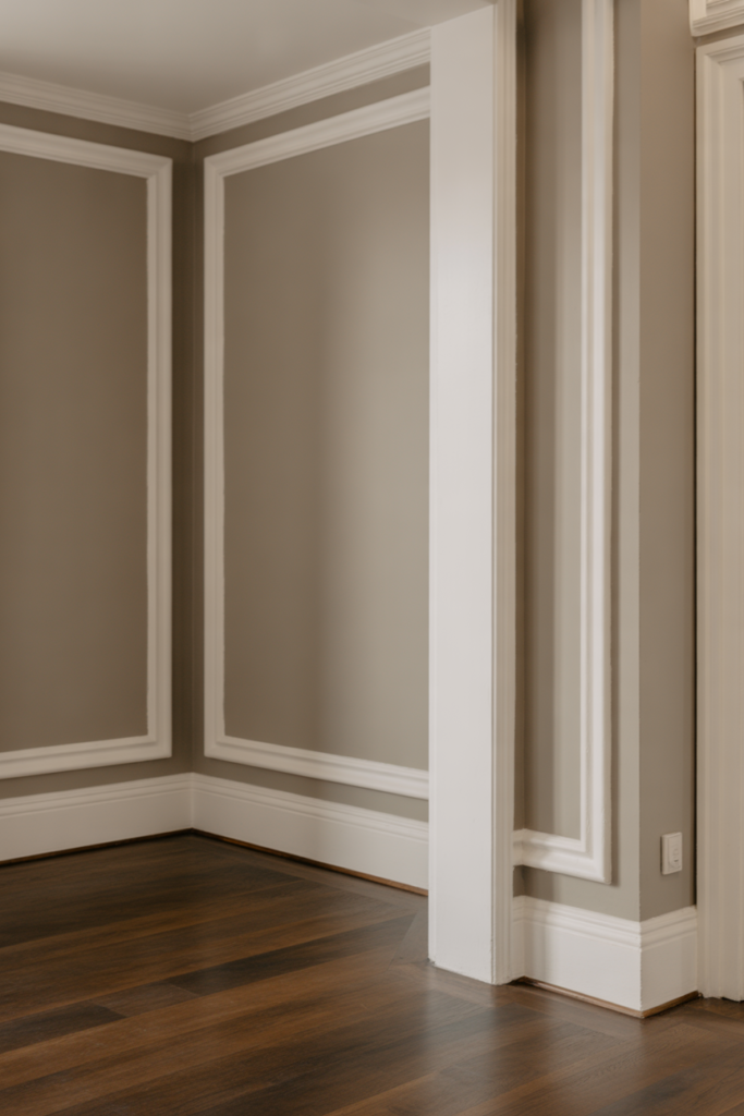
Greige blends gray and beige into one calm shade. It is a safe choice for open homes where rooms connect. Greige does not pull too cool or too warm which helps it work with many styles. It looks good with white trim dark floors and even black accents. Over time this color stays pleasing and does not feel dated which is why designers keep using it year after year.
3 Light Beige That Adds Quiet Warmth

Light beige brings comfort without feeling heavy. It works well in living rooms where families gather. This color supports soft furniture tones and natural fabrics. It also hides small wall marks better than white. When paired with warm lighting light beige makes a room feel calm and steady which many homeowners want after a long day.
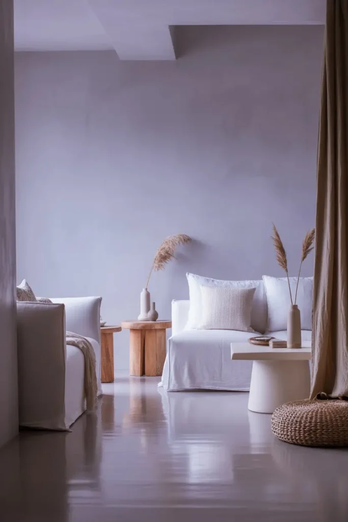
4 Pale Gray With a Soft Undertone
Not all gray is cold. A pale gray with a warm base keeps walls light while adding depth. This shade works best in rooms with good daylight. It creates a clean look without feeling empty. When styled with wood and soft textiles it feels modern yet cozy. The key is choosing gray that does not lean blue which can feel harsh.
5 Creamy Ivory for Gentle Elegance
Creamy ivory sits between white and beige. It adds softness and warmth without darkening the room. This color works well in bedrooms and dining spaces. It supports classic decor and modern pieces equally. Ivory also helps art and wall decor stand out in a natural way.
6 Soft Taupe for Grounded Spaces

Taupe mixes brown and gray in a balanced way. Soft taupe gives rooms a grounded feel. It works well in offices and reading areas where calm focus matters. This color pairs well with leather wood and metal accents. It holds warmth while still feeling clean and modern.
7 Muted Sage Green for Natural Calm
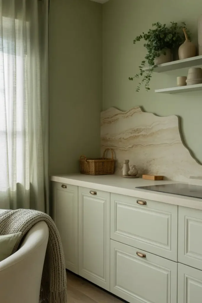
Muted sage green brings the outdoors inside. It feels calm and fresh without being bold. This color works well in kitchens bedrooms and bathrooms. It pairs beautifully with white cabinets and natural stone. Sage green supports rest and balance which makes it a smart choice for busy homes.
8 Dusty Blue That Feels Peaceful
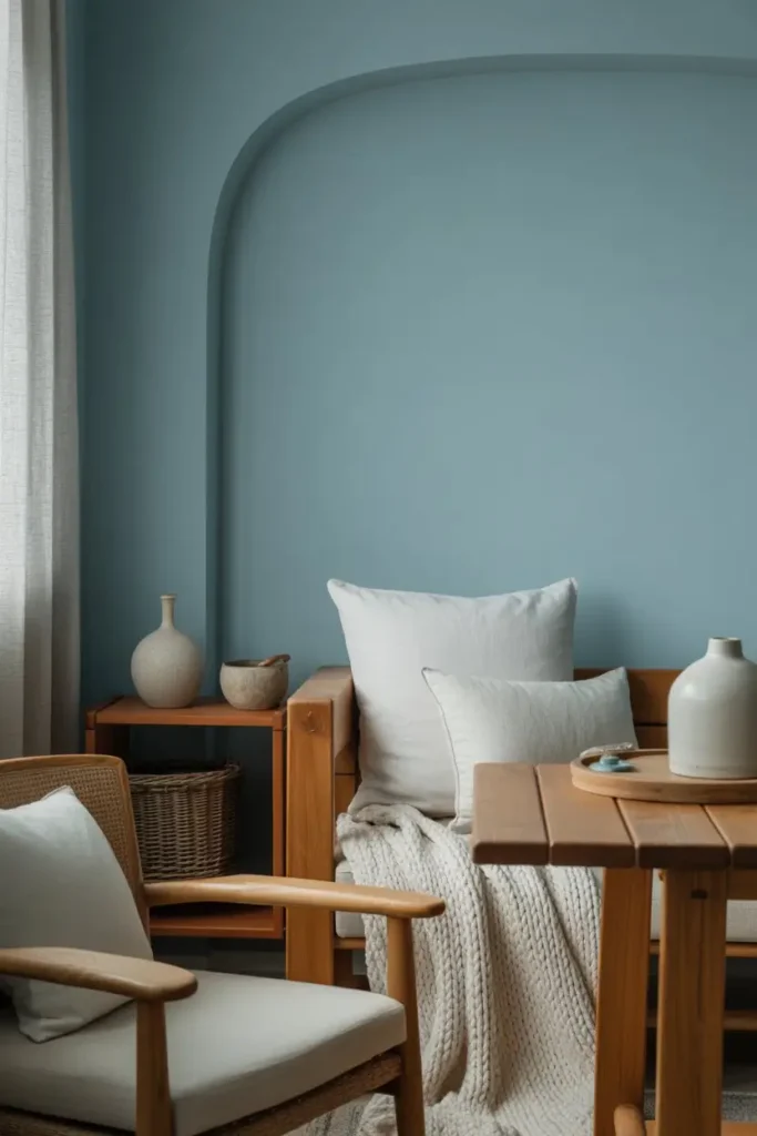
Dusty blue is soft and slightly gray. It avoids the bright look of bold blue. This shade works well in bedrooms and quiet living areas. It creates a sense of calm and order. When paired with warm woods and soft whites it feels peaceful rather than cold.
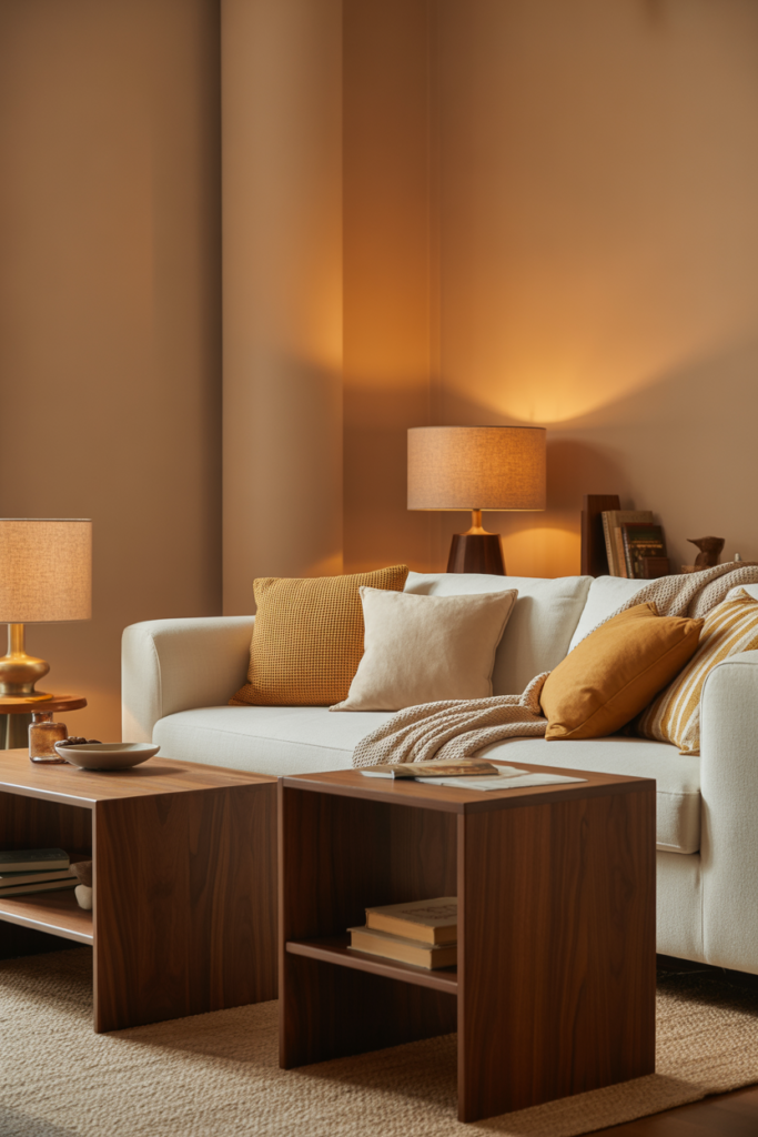
9 Warm Clay Beige With Depth
Clay beige adds a hint of earth tone to walls. It feels warm and natural without being dark. This color works well in homes with lots of sunlight. It pairs well with woven textures and neutral decor. Clay beige adds character while staying easy to live with.
10 Soft Blush Neutral for Gentle Warmth

Soft blush neutral is not pink in a bold way. It carries a warm base that softens rooms. This color works well in bedrooms and sitting areas. It reflects light gently and adds warmth to white furniture. When done right blush neutral feels modern and inviting.
11 Light Mocha for Cozy Comfort
Light mocha adds warmth without heaviness. It works well in family rooms and dens. This color supports darker furniture and soft fabrics. It also hides wear better than lighter shades. Mocha tones help rooms feel secure and comfortable.
12 Pale Olive for Subtle Character
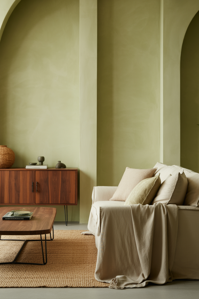
Pale olive is a soft green with a warm base. It adds interest without overpowering the room. This color works well in dining rooms and entry spaces. It pairs well with wood metal and neutral fabrics. Pale olive feels fresh yet grounded.
13 Warm Stone Gray for Modern Homes
Stone gray with warmth avoids the cold feel of standard gray. It works well in modern homes with clean lines. This color supports black white and wood finishes. It creates contrast while keeping the space calm and balanced.
14 Soft Sand Tone for Bright Rooms
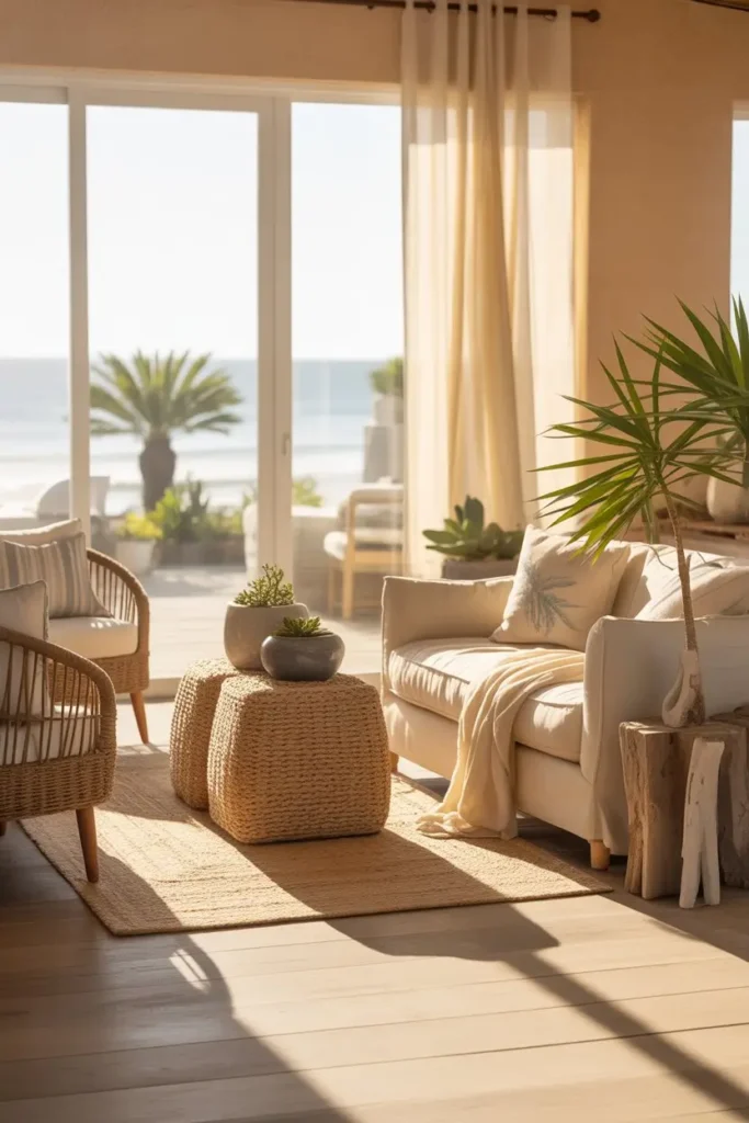
Sand tone brings warmth and light together. It works well in rooms with large windows. This color reflects sunlight in a gentle way. It pairs well with coastal and natural styles. Sand tones help rooms feel open and relaxed.
15 Muted Terracotta for Warm Depth
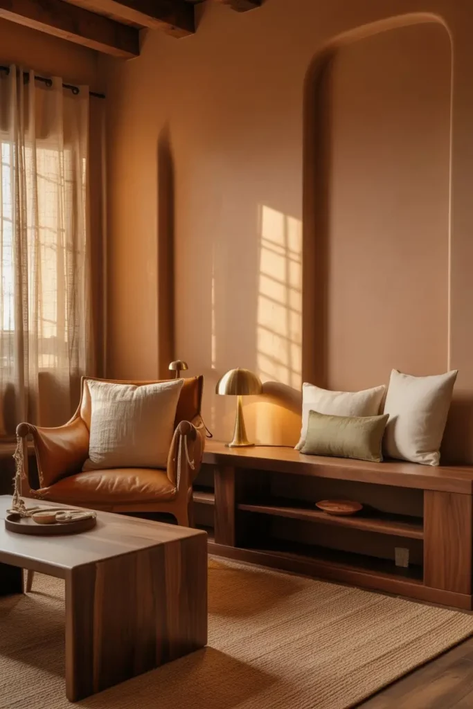
Muted terracotta adds warmth and depth without bold color. It works well as a main wall color in cozy spaces. This shade supports wood leather and neutral fabrics. It adds personality while still feeling timeless.
16 Pale Lavender Gray for Quiet Style
Lavender gray is subtle and calming. It carries a soft tone that changes with light. This color works well in bedrooms and creative spaces. It adds interest without feeling loud. When paired with white and natural textures it feels peaceful and refined.
FAQs
Final Thought
Interior paint colors ideas should serve your life not trends. The best color feels right in the morning and calm at night. When you choose shades with warmth balance and purpose your home will feel comfortable for years. Paint is not just color on walls. It is the feeling you live with every day.