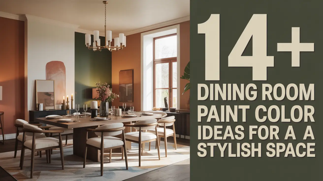
14+ Dining Room Paint Color Ideas for a Stylish Space
A dining room is more than a place to eat—it’s where conversations flow, memories form, and guests feel welcome. The paint color you choose sets the stage for all of it. After over 20 years of helping clients design homes, I’ve learned that the right dining room paint can change not just the look of a space, but also the way food tastes, light feels, and guests behave.
If you’re searching for the best dining room paint colors for a stylish space, this guide covers more than 14 proven ideas. Each one is explained with real-world tips on undertones, lighting, finishes, and styling. No vague advice—just practical solutions you can use today.
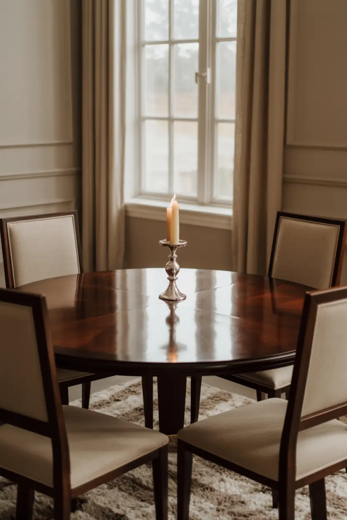
1) 4 Classic Neutrals for a Timeless Dining Room
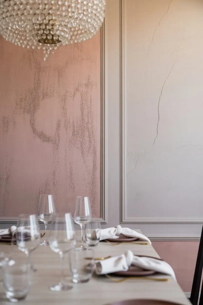
Neutral colors never go out of style. Warm white, greige, soft taupe, and cream create a calm background that allows your dining table and decor to shine. The trick is in the undertone. A warm white with a touch of yellow flatters wood furniture and creates a welcoming glow. Greige works best when you want the cool look of gray without the sterility. Soft taupe grounds the room and makes big dining areas feel intimate. Cream adds light but avoids the starkness of plain white.
To optimize these neutrals, paint trim a shade lighter for contrast, and ceilings a shade brighter for lift. Always test in both natural daylight and evening light since neutrals shift more than bolder tones.
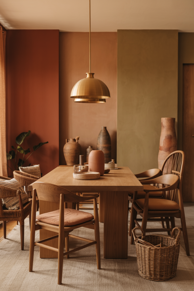
2) 3 Warm Earth Tones That Invite Comfort
Dining rooms thrive on warmth. Terracotta, clay red, and olive green all bring a grounded, cozy feel. Terracotta pairs beautifully with brass lighting and natural wood, perfect for evening meals. Clay red makes dishes appear richer and guests linger longer. Olive green adds sophistication and works especially well with oak or walnut dining sets.
These shades create an earthy balance, especially in rooms with colder northern light. Add warm bulbs and woven textures to complete the cozy atmosphere.
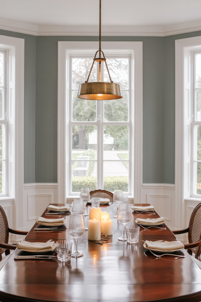
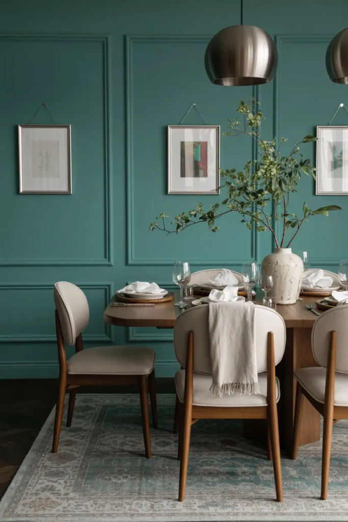
3) 3 Cool Blues and Greens for Fresh Calm
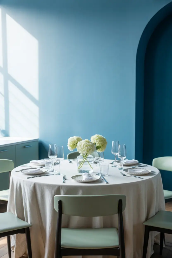
Cool tones like dusty blue, teal, and seafoam green slow the pace of a meal and bring peace to the space. Dusty blue is perfect for traditional dining rooms with lots of light. Teal works in modern homes where you want a deeper personality. Seafoam green adds breeziness and pairs with crisp white trim for coastal style.
The key is balance. Since cooler tones can dull food presentation, pair them with warm accents like wood bowls, golden cutlery, or cream textiles.
4) 2 Bold Deep Hues for Dramatic Dining Rooms
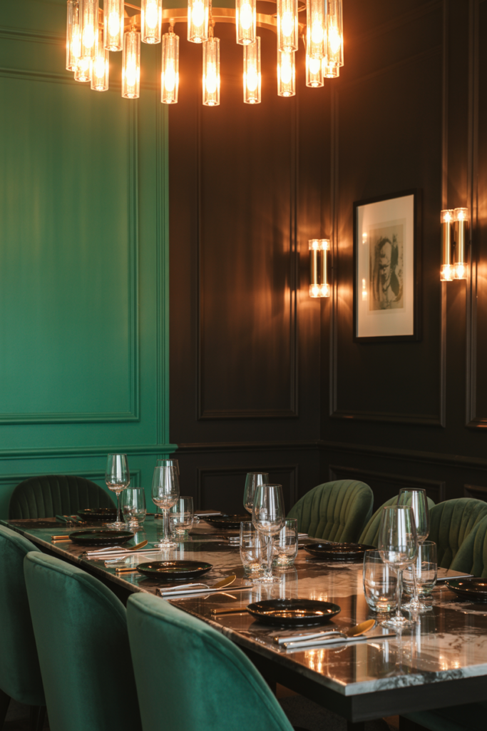
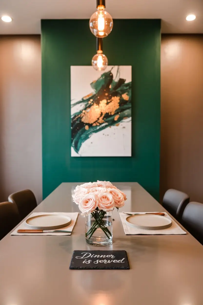
Want to wow your guests? Go bold with deep emerald or charcoal black. Emerald creates luxury when combined with velvet, brass, or marble. Charcoal black adds intimacy, especially in formal dining spaces.
Use these bold paints on all walls for a cocooning effect or as a backdrop wall for art or a sideboard. Keep trims glossy white to prevent heaviness. Lighting matters here—warm dimmable bulbs will prevent the space from feeling closed in.
5) 2 Soft Pastels for Cheerful Meals
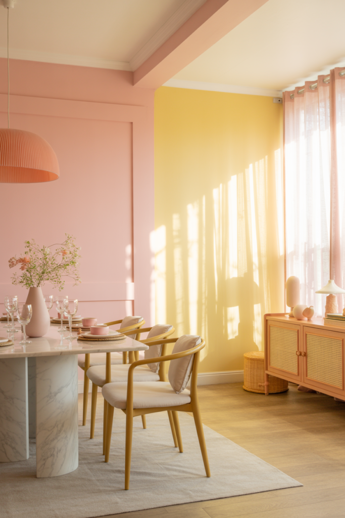
Pastels aren’t just for kids’ rooms. Powder pink and pale lemon are sophisticated when paired with the right furniture. Pink works well with gold details, marble, and soft linens. Lemon yellow brings cheer and sunlight even to north-facing rooms.
Always pair pastels with warm lighting to avoid a flat look. Balance them with natural textures like rattan, wood, and ceramic tableware.
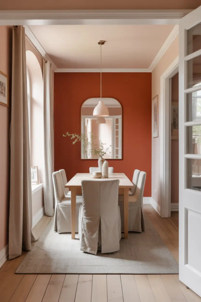
6) 1 Accent Wall Idea That Adds Personality
An accent wall is the easiest way to introduce personality without overwhelming. Pick the wall that sits directly behind the dining table. Paint it in a bold hue or a textured paint for depth. This creates a natural focal point for photos, artwork, or lighting fixtures. Keep the other walls neutral to let the accent wall shine.
7) 1 Two-Tone Wall Strategy for Visual Interest
Two-tone paint tricks the eye and changes proportions. A darker lower section grounds the room while a lighter top opens it. This style not only looks sophisticated but also protects lower walls from scuffs and stains. A chair rail or a sharp paint line makes the division look intentional.
Match the darker shade to your floor or table base to tie the design together. This subtle trick adds elegance without needing extra decor.
8) 1 Ceiling and Trim Approach That Completes the Room
Never overlook ceilings and trim. A crisp white ceiling makes rooms taller, while a matching wall-and-ceiling color blurs edges and makes small rooms feel bigger. For trims, a glossy white adds polish, while soft cream softens formal rooms.
If you want bold design, paint crown molding the same color as walls to create a seamless effect. Always use durable finishes on trim since it sees the most wear.
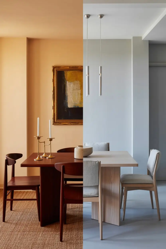
9) 1 Lighting and Paint Harmony Rule
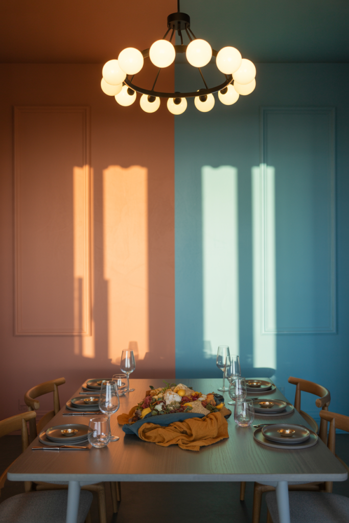
Light changes everything. Warm bulbs enhance reds, terracottas, and creams. Cool bulbs bring out blues and greens. For dining rooms, warm LED bulbs are best because they flatter both skin tones and food colors.
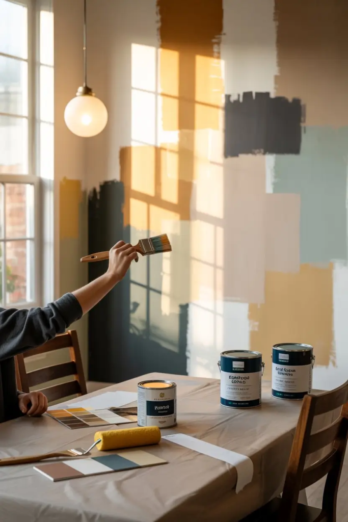
Always test paint swatches in both natural light and under dining room lighting before committing. A color that looks perfect at noon may look muddy during dinner.
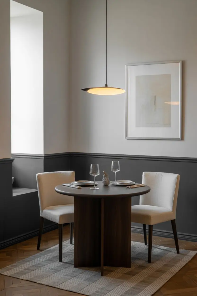
10) 1 Sheen and Finish Guide for Dining Walls
Sheen matters just as much as shade. Matte hides wall flaws but can be hard to clean. Eggshell is the sweet spot: soft, slightly reflective, and washable. Satin works well if you have kids since it wipes clean easily. Trim looks best in semi-gloss or gloss, which also adds reflection.
Choosing the right finish ensures your dining room looks polished but also stands up to daily use.
11) 1 Undertone Check to Avoid Costly Mistakes
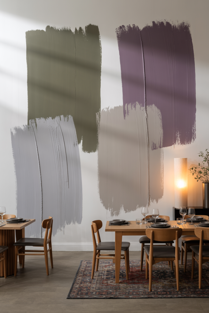
Every paint has an undertone. A “neutral gray” may lean green or purple under certain lights. Always test large swatches on your dining walls. Compare them to your flooring, table, and rugs. Undertones that clash will make the room feel off even if the main color looks right.
Spend a day watching the swatch in different lights. This small step saves money and frustration later.
12) 1 Pairing Rule for Wood, Metal, and Fabrics
Your dining furniture and finishes matter as much as wall paint. Warm paints highlight rich woods like cherry and teak. Cool paints flatter lighter woods like ash or gray oak. Brass or gold hardware warms up cool shades, while silver or chrome keeps warm tones looking fresh.
For balance, always create contrast: dark wood with light walls, or pale wood with darker paint. This avoids monotony and makes each element stand out.
13) 1 Color Trick for Small Dining Rooms
Small dining rooms can still feel open. Use light colors on both walls and ceiling to blur lines. Add a semi-gloss trim for reflection. If you want a bold accent, keep it to one wall only.
Mirrors and lighter textiles pair well with soft paint tones, helping expand the visual space. Avoid heavy dark colors unless balanced with lots of natural light.
14) 1 Styling Move That Ties Paint to Decor
Consistency makes rooms feel intentional. Echo your wall color in decor: a rug, a lamp, or napkins. For example, if you paint the walls teal, repeat that teal in a vase or framed print. This creates rhythm and makes the design cohesive without clutter.
15) 1 Final Testing and Durability Plan
Before painting the whole room, always test. Apply a large sample on multiple walls and live with it for a week. Observe under natural light, warm light, and evening shadows. If it feels right, commit. If not, adjust.
Choose high-quality, low-VOC paints for durability and better air quality. Keep leftover paint for touch-ups after gatherings.